
For decades, beige has been the go-to neutral, beloved for its safety and subtlety. However, today’s interiors are moving beyond beige to embrace a wider spectrum of neutral colours that bring warmth, sophistication, and a sense of effortless elegance to any room. It’s not just about blending in—the new neutrals command attention with their quiet confidence. From calming taupes and creamy off-whites to earthy greys and gentle clay tones, these shades give your home a nuanced, layered look that never feels dated.
Elements of an Enduring Neutral Scheme
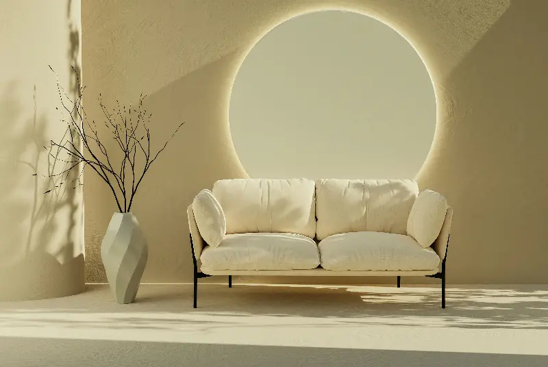
A timeless neutral palette goes beyond a single colour. The magic happens through clever combinations and thoughtful contrasts, creating a backdrop that is both inviting and versatile. Here’s how modern designers curate spaces that feel rich, even without bold hues:
- Layering Tones: Mix warm and cool neutrals—a soft greige sofa paired with crisp white walls, or sandstone accents against moody mushroom paint—adding depth and sophistication.
- Playing with Texture: Neutrals shine brightest when paired with tactile elements. Think plush wool throws, sleek marble countertops, or weathered timber beams. Texture invites the senses to linger where colour whispers quietly.
- Natural Materials: Incorporate rattan, linen, leather or clay. These materials carry subtle natural colours that complement any scheme.
It’s the interplay between shades and surfaces that lends a neutral room its sense of effortless luxury.
International Inspiration: Neutrals Across Cultures
Neutral palettes have a global history. Each culture puts its own stamp on what constitutes understated elegance:
- Scandinavian homes favour cool, light greys and whites, maximising natural light and embracing simplicity.
- Japanese interiors introduce soft taupes and stone hues, fostering calm and balance.
- Mediterranean design is rooted in chalky, warm earth tones—think pale terracotta, olive, and sand.
By borrowing details from different traditions—be it through artisanal tiles, woven mats, or handcrafted ceramics—you can infuse your neutral spaces with worldly charm.

Why Timeless Neutrals Always Feel Fresh
Unlike fleeting colour trends, rich neutral palettes adapt beautifully to changing tastes and styles. They are the perfect canvas for self-expression. Here’s why they endure:
- Neutrals make rooms feel bigger, brighter, and more breathable.
- They complement a wide variety of furniture styles, from modern minimalism to classic antiques.
- A neutral background allows you to easily update a room’s energy—just swap out cushions, artwork, and throws for a seasonal refresh.
- Subtle, balanced tones evoke tranquillity and relaxation; ideal for a space to unwind.
The beauty of neutrals is their chameleon-like ability to evolve—they never overwhelm, yet never fade into obscurity.
Curating Your Own Effortlessly Elegant Space
To move beyond beige, start with these simple steps:
- Choose a hero neutral for walls or large furniture—think oat, smoke, or chalk.
- Introduce supporting tones a few shades lighter or darker for contrast.
- Add layers of texture—knitted cushions, woven rugs, and ceramics.
- Accessorise with subtle patterns like herringbone, chevron, or fine stripes in complementary hues.
- Let natural light work its magic—the true undertones of neutrals reveal themselves with changing daylight.
Remember: true elegance comes not from sameness, but from harmony and quiet individuality.
A Canvas Waiting for Your Story
In the end, a neutral home is more than just a trend—it’s a living backdrop, ready to reflect your memories, travels, and personal style. With shades that soothe and textures that intrigue, the most enduring neutral palettes invite you to slow down, breathe deeply, and dream about your next transformation. What hues—or stories—will you layer onto your own canvas?