
Imagine walking into a room awash in calming shades of blue, or passing a storefront splashed with energetic reds and yellows. Without knowing why, you might feel instantly soothed or subtly excited. This is not a trick of the mind—color has a powerful voice, whispering to our subconscious and affecting our moods, decisions, and reactions.
From the earliest cave paintings to the sleek websites of today, humans have relied on color to communicate meaning, evoke emotions, and express identity. But what exactly are colors saying, and why do we hear them so keenly?
THE SCIENCE OF COLOR PERCEPTION
Our interaction with color begins with biology. When light enters our eyes, it strikes the retina, where special cells called cones translate wavelengths into colors. This physical process is the foundation, but our reaction to color is anything but straightforward. Cultural backgrounds, personal experiences, and even the time of day influence how we see and feel about colors.
Some hues trigger nearly universal reactions:
- Red: Shown to raise heart rates and stimulate appetite; popular in fast food branding and romantic settings.
- Blue: Tends to calm us, slow our breathing, and create a sense of trust and reliability.
- Yellow: Often signals optimism and clarity, though in excess, it can cause eye fatigue or anxiety.
It is no coincidence that banks and tech companies often bathe their logos in blue, while emergency signs demand attention in high-intensity red.
CULTURAL MEANING: ONE COLOR, MANY STORIES
While biology lays the groundwork, culture adds layers of meaning. Palette choices speak not one but many languages, and a color that sings of prosperity in one context may whisper of misfortune in another.
Consider these striking cultural contrasts:
- White: In Western cultures, it signifies purity and peace (the bride’s gown). In parts of Asia, it can represent mourning or the cycle of life and death.
- Green: Conjures lush forests and renewal in the U.S., but can represent immortality or even jealousy in other regions.
- Purple: Historically associated with royalty and wealth in Europe due to the rarity of the dye, whereas in some Latin American cultures, it is linked to sorrow.
EMOTION IN EVERY STROKE: ARTISTS AND THE COLOR WHEEL
Artists have long been students of color psychology. The color wheel, conceived by Isaac Newton in the 17th century, helps creatives plan vibrant, harmonious, or contrasting palettes.
Creatives use specific relationships to guide the viewer's eye:
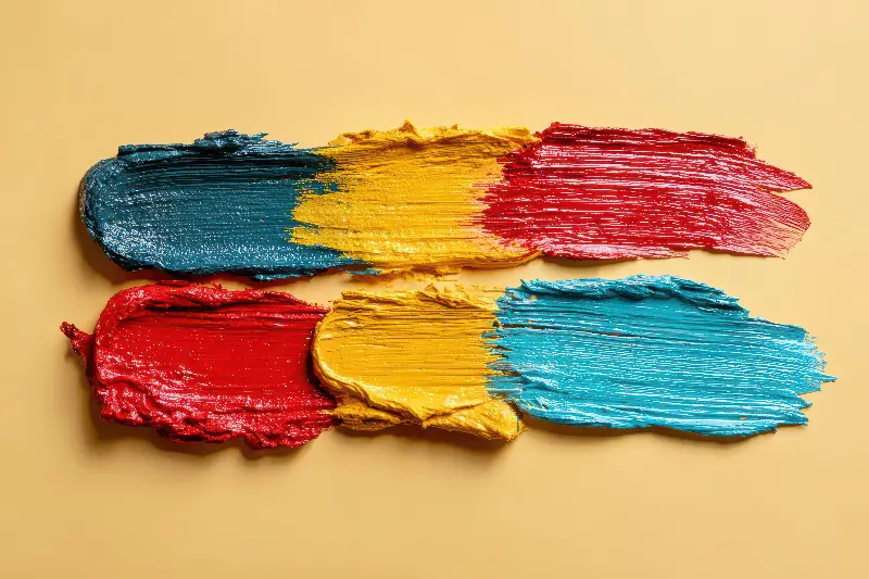
- Complementary Colors: Opposites on the wheel (like blue and orange) that create high tension and vibrant energy.
- Analogous Colors: Neighbors on the wheel (like red and orange) that provide a sense of harmony and serenity.
Vincent van Gogh famously believed, "There is no blue without yellow and without orange." He used clashing colors to evoke emotional intensity. Meanwhile, Impressionists like Claude Monet explored how changing light altered the psychological effects of the same scene, painting haystacks at dawn, midday, and dusk to capture shifting moods.

MODERN COLOR PSYCHOLOGY: BEYOND THE CANVAS
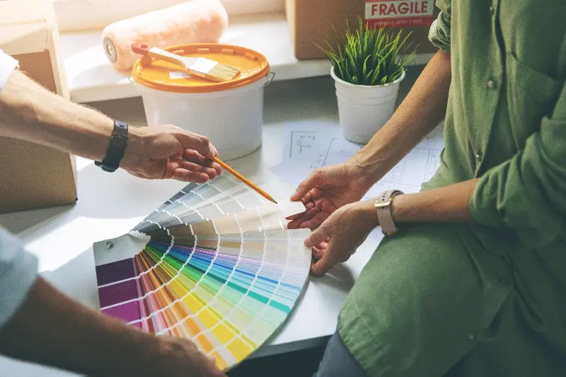
Our fascination with color adventures far beyond galleries. Paint companies know that people are more likely to purchase a home painted in neutral tones, while bright accent walls signal creativity and freshness.
Marketers harness color to elicit reactions within seconds:
- Exclusivity: Luxury brands gravitate toward black for sophistication.
- Comfort: Warm colors like orange and yellow encourage conversation, making them ideal for kitchens.
- Productivity: Cooler shades can boost concentration in workspaces, while subtle greens aid relaxation in bedrooms.
Digital spaces have their own color dialects. Designers favor balanced palettes and extensive usability testing because high-contrast schemes can quickly exhaust a viewer's eyes.
COLOR AND IDENTITY: SELF-EXPRESSION THROUGH HUE
For many, choosing colors is about self-expression. In art therapy, individuals use color to externalize feelings they cannot put into words. Someone drawn to bold reds and oranges might be asserting their individuality, while others leaning toward gentle pastels may yearn for safety or peace.
Psychologists note that these preferences are not fixed. Life changes, new experiences, and even the seasons can shift our inclinations:
- Spring: A natural pull toward lighter, "budding" shades.
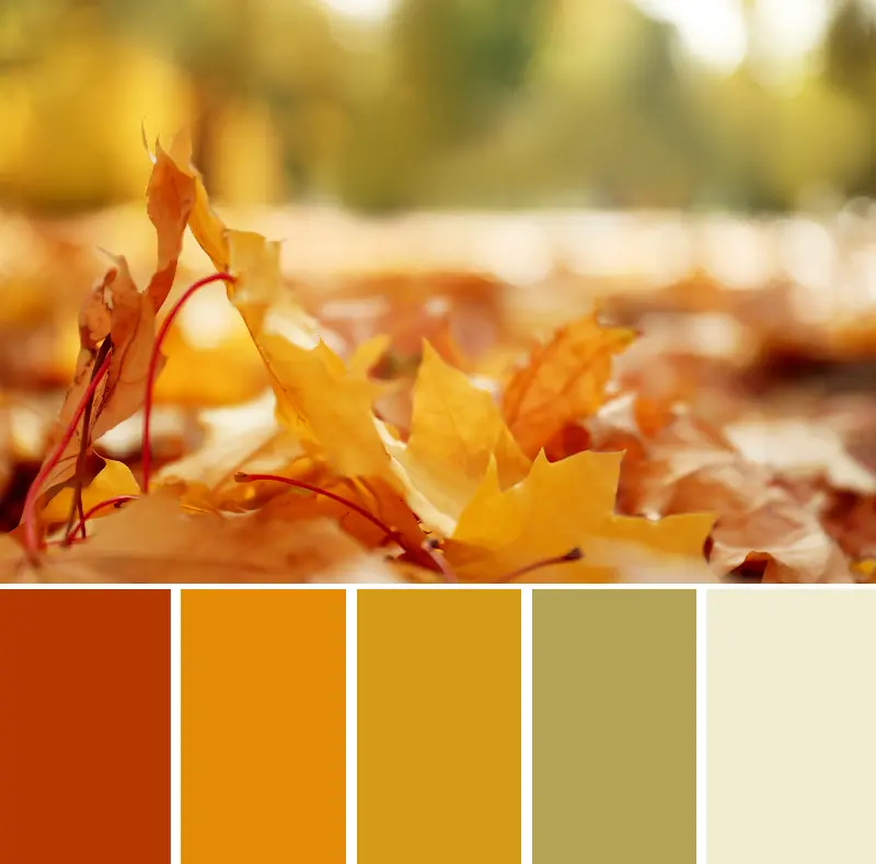
- Autumn: A craving for warm, grounded earth tones like terracotta and mustard.
- Life Transitions: A move toward neutrals during times of chaos to find mental "blank space".
THE SILENT LANGUAGE OF PALETTES
Whether you’re redecorating a room, experimenting on canvas, or selecting the perfect outfit, you are part of a centuries-old conversation. Colors can energize, calm, inspire, or provoke. They offer an expressive palette, both personal and universal, for shaping how we see the world and how the world sees us.
Next time you choose a color, remember: it is never just a shade, but a powerful message waiting to be heard.