
Sleep is one of life’s simplest, most restorative pleasures. Yet, millions of us struggle every single night to drift off smoothly or wake up feeling truly refreshed. While daily lifestyle choices and stress levels certainly affect our rest, one of the most underrated factors is the physical environment we create within our bedrooms.
The specific colors on your walls, bedding, and decor have a profound biological effect on how quickly your brain winds down and how deeply you sleep through the night. By consciously choosing a scientifically backed, calming color palette, you can unlock genuine bedroom bliss and dramatically elevate your nightly rest.
The Biology of Color and Sleep
Our brains are incredibly sensitive to environmental visual cues, and color stands as one of the most powerful psychological triggers in nature.
- The stimulation of warm hues: Vibrant tones like red and orange can actively raise our heart rate, blood pressure, and adrenaline levels. While these are excellent for high-energy spaces like home gyms or dining rooms, they are counterproductive for resting spaces.
- The tranquility of cool hues: Cool colors—specifically those in the blue and green families—biologically trigger the opposite response. They help slow our heart rate, deepen our breathing, and signal the nervous system to relax.
A fascinating clinical study published in the journal Sleep revealed that individuals who slept in blue bedrooms enjoyed nearly eight hours of rest on average. This was a full hour more than those sleeping in highly stimulating shades. This is biology in action. Our bodies associate cool, soft hues with the inherent tranquility of a clear twilight sky or a quiet, leafy forest.
Top Calming Palettes and Their Psychological Effects
Crafting the perfect sleep sanctuary goes far beyond simply picking a random shade of blue. Understanding the specific nuances of different color families helps you maximize physiological relaxation.
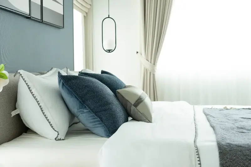
- Soft blues: Shades like light sky blue, powder blue, and muted teal are perennial favorites for bedrooms. These colors encourage lower blood pressure and slower respiration, helping you drift off to dreamland effortlessly.
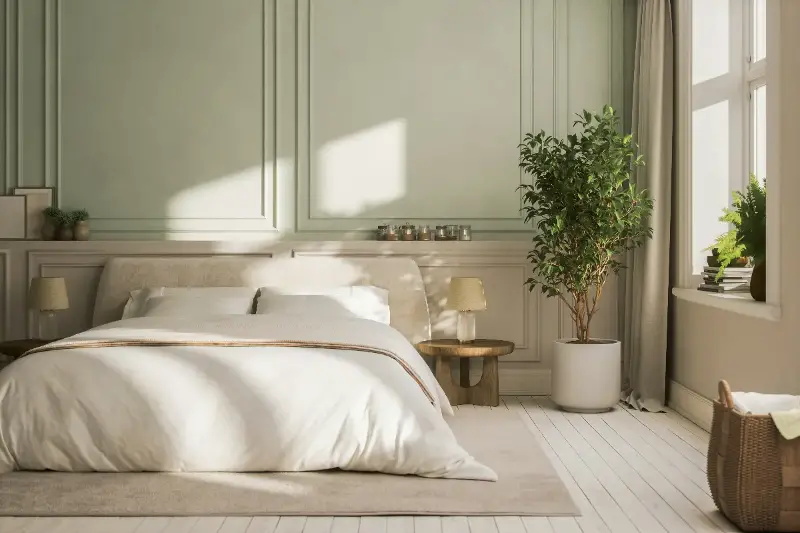
- Serene greens: If blue feels a bit too chilly for your taste, consider muted sage, soft moss, or eucalyptus green. Green represents renewal and balance. Because it sits at the center of the visible light spectrum, it is literally easy on the eyes, requiring no strain for your optical nerves to process.
- Gentle grays and neutrals: A soft dove gray or a misty fog shade creates an uncluttered, contemporary backdrop. These neutrals clear visual noise, though it is best to avoid dark, cold grays which can feel draining rather than restful.
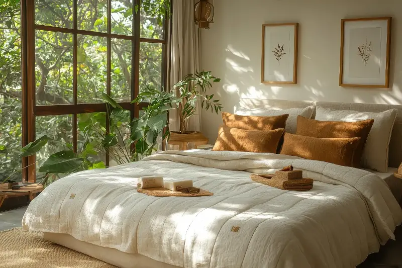
- Earthy tones: Sandy beige, warm taupe, and creamy ivory lend a grounded, cocoon-like feel to a bedroom. These natural environments are universally associated with comfort and safety.
How Lighting Interacts With Your Chosen Palette
Lighting can dramatically alter the appearance and emotional temperature of your bedroom colors. In rooms with abundant morning sunlight, cool colors appear incredibly crisp and airy, making your wake-up routine feel naturally energizing. In darker rooms, selecting a palette with slightly warmer undertones—like blue-grays or green-beiges—prevents the space from feeling bleak.
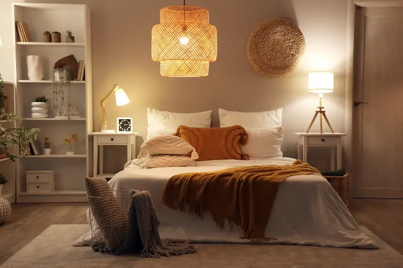
Your choice of artificial bulbs is equally critical to protecting your circadian rhythm. Ensure you utilize LED bulbs rated for a soft white glow (2700K to 3000K). This temperature mimics the soothing, golden wavelengths of sunset, which effectively triggers your body's natural melatonin production. Conversely, avoid stark daylight bulbs, as their high blue-light content disrupts sleep cycles and makes serene wall colors appear clinical and harsh.
Personalizing Your Sanctuary with Texture and Accents
Your bedroom should be an authentic personal sanctuary tailored to your lifestyle. When selecting your palette, consider the tactile elements that will interact with your colors.
To maximize the soothing effects of your palette, pair your wall tones with cozy, rich textiles like linen throws, velvet cushions, and plush wool rugs. Opt for a matte paint finish over a glossy one, as matte surfaces diffuse light softly and minimize harsh, disruptive glare.
If you absolutely love bright, bold colors, you do not have to banish them entirely. Simply confine them to small, intentional accent pieces—such as decorative pillows, lamps, or artwork. This allows you to express your personal style without overpowering the deeply restful, restorative energy of your room.