
Stepping into a beautifully designed classic interior is like entering a timeless world where style endures and every element feels carefully chosen. Behind the effortless elegance seen in these spaces lies a thoughtful approach to color. If you’ve ever wondered how celebrated designers create environments that never go out of fashion, the secret often starts with their grasp of five foundational color principles. Master these and you’ll be well on your way to achieving that coveted lasting elegance—no matter your decor preferences or experience.
Start with a Subtle Base Palette
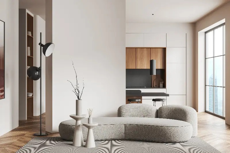
Every classic interior tells a quiet but impactful story, and it usually begins with a well-considered base palette. Think of this layer as the canvas upon which all other elements are built. Designers who specialize in timeless elegance gravitate towards subdued neutrals such as soft whites, gentle beiges, and elegant greys. These hues provide a calming foundation, allowing for flexibility when incorporating furniture, art, or accents in richer or more saturated shades.
What’s especially fascinating is the psychological effect of a muted base. These shades reflect more natural light, creating a spacious feel, while also soothing the eye and making a room feel harmonious. This backdrop helps other colors used in the space to shine without overpowering the senses. If you’re aiming for an environment that looks upscale but feels inviting, choosing the right neutral is the step that quietly ties everything together.
Embrace Contrast for Visual Interest
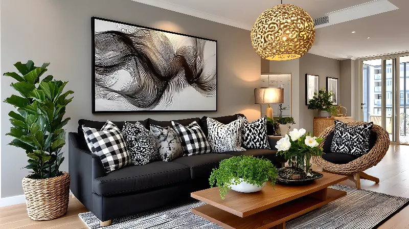
Contrast is the secret ingredient that keeps a classic room from feeling flat or predictable. You’ll notice the world’s most elegant interiors aren’t afraid to pair light walls with darker wood tones, or to set off pale upholstery with deep navy or rich burgundy. Strategic contrast helps define architectural features, highlights beautiful furniture, and enlivens traditional settings with a contemporary twist.
There’s an interesting science behind this too. The human eye naturally seeks out regions of variation, making spaces with well-balanced contrasts feel more dynamic. To achieve classic appeal, introduce contrast thoughtfully—think about inky black window frames against soft plaster, or a crisp white trim bordering a smoky blue wall. Keep the effect balanced rather than jarring: even within contrast, cohesion matters.
Harness Accent Colors with Intention
Accent colors are the punctuation marks of any room. In classic interiors, these are used sparingly but effectively, often echoing hues found in nature, such as deep greens, regal blues, or warm ochres. What marks classic accent use is restraint; instead of overwhelming a space, accents pop up in curated details—think throw pillows, rugs, vases, or a statement piece of art.
Interestingly, studies show that humans are drawn to consistent repetition of accent colors, which unconsciously signals order and sophistication. Classic interiors typically pick one or two accent shades and repeat them in varying amounts and textures, creating a subtle thread that unites the space. By anchoring the eye in this way, you get rooms that feel both cohesive and full of personality.
Respect the Power of Undertones
One of the most overlooked principles in achieving classic color harmony is understanding undertones. Two shades of white, beige, or gray can look wildly different depending on whether their undertones are cool (blue, green) or warm (yellow, pink). This nuance becomes crucial in classic interiors, where the wrong undertone can clash with woodwork, furnishings, or even light fixtures, subtly sabotaging the serene effect you’re after.
Seasoned designers always check swatches in different lighting and against key furnishings before making decisions. If you’re adding a new wall color or reupholstering a favorite chair, pay close attention not just to your primary color but its underlying tone. The most enduring spaces are those where undertones are consistent, assuring that every layer—paint, textiles, flooring—feels like part of a carefully constructed whole.

Balance Pattern and Color for Timelessness
Classic interiors are far from empty or monotonous; instead, their enduring appeal often comes from beautifully integrated patterns paired with a restrained color palette. The trick lies in scale and repetition. For example, a subtly patterned damask wallpaper in gentle tones, complemented by curtains in solid but related hues, provides dimension and a sense of grandeur without overwhelming the senses.
A compelling fact is that mixing patterns—stripes with florals, checks with botanicals—actually works best when the underlying color story is tight. Experts recommend picking patterns that share a base color or vary only by a shade or two for consistency. This approach encourages layers of interest without sacrificing the peacefulness that makes classic interiors so inviting. Don’t be afraid to introduce a signature pattern—a heritage rug or iconic toile—but keep it within a familiar color range to ensure it feels integrated rather than abrupt.
True classic elegance doesn’t rely on expensive pieces but on the subtle mastery of color relationships. By grounding your choices in these five core principles—starting with a quiet palette, playing with contrast, adding accents with intention, honoring undertones, and harmonizing patterns and colors—you’ll create a home that feels sophisticated today, tomorrow, and for many years to come. Timeless is never accidental—it’s the beautiful result of color choices made with care and a discerning eye for longevity.