
Have you ever looked in the mirror and felt like something about your outfit just didn’t look quite right—and you couldn't put your finger on why? Many of us have had that experience. While choosing clean lines and a good fit are both crucial to a well-put-together look, sometimes the true culprit behind a less-than-stellar outfit is colour matching. Even the most fashion-forward dressers can fall prey to common colour pairing pitfalls, as some combinations can make even the sharpest ensemble look mismatched, dull, or a bit over the top. Here’s a closer look at surprising colour matches that stylists say can sabotage your outfit—and, more importantly, how to sidestep these style slips and find winning combinations.

The Lessons From Colour Theory
Not all colours play nicely together. While colour blocking and unexpected combinations have their place in fashion, stylists often refer to classic colour theory to find the most harmonious pairings. This is because some colours, although striking on their own, can clash visually or create jarring contrasts when worn together.
For example, pairing cool tones with overly vibrant warm ones—like a bright blue top with tomato red trousers—can overwhelm the senses. Instead, focusing on analogous colours (those next to each other on the colour wheel) produces a calming effect, while complementary colours (opposites on the wheel) offer bolder but still harmonious results if balanced well.
Mismatching Neutrals: An Underestimated Trouble
It may sound impossible to go wrong with neutrals, but it happens more often than you’d think. Not all beiges, greys, and browns are created equal. Mixing a warm, yellow-beige with a cool, blue-grey can throw off the subtle sophistication of neutrals. The result often looks flat and can make garments appear old or dirty.
Stylists recommend choosing neutrals from the same undertone family. For instance, pair cool greys together, or build your outfit around several warm, creamy beiges. If you want to mix, add a clear contrasting colour (like navy or forest green) to intentionally break up the difference.
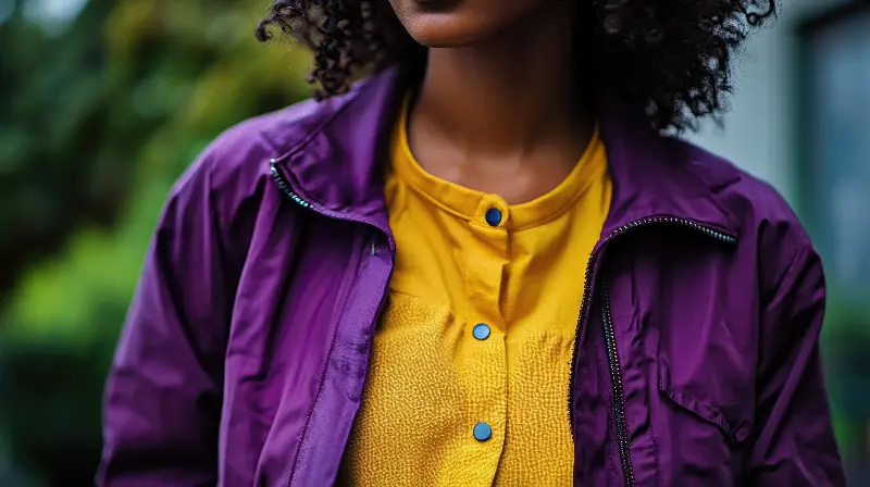
Bold On Bold: When Statement Colours Compete
Fashion’s recent embrace of dopamine dressing—outfits made from bold, vibrant colours intended to boost mood—can go astray when two similar “power hues” compete for attention. Pairing electric purple with neon green, for example, might work on the catwalk, but in everyday scenarios, it rarely flatters.
Instead of matching brights with brights at random, stylists suggest combining a standout colour with more subdued tones or neutrals. If you’re wearing crimson trousers, try topping them with a clean white turtle neck rather than yet another attention-grabbing colour.

Blending Different Black Tones: A Subtle Yet Common Slip
All black outfits are a timeless choice, yet they have one hidden pitfall—different “blacks” can clash due to varying fibre contents and dye lots. Pairing a sun-faded black tee with brand new jet-black jeans, for instance, can make the tee look washed out and the jeans much harsher than intended.
To avoid this, either purposely mix fabrics for a tactile effect (think velvet with leather) or try to match tones as closely as possible by buying items together or from similar collections. If you can’t match, break up blacks with a belt, scarf or statement jewellery.
Red And Green: More Than Just Holiday Hues
Few colour matches carry as much cultural baggage as red and green. While technically complementary, these colours are so strongly associated with festive December dressing that they’re a risky pairing for most of the year.
Stylists recommend softening this combination by altering the intensity. Instead of classic emerald green and bright red, try rusty reds with deep olive, or pale mint with coral for a fresh, modern look. Introducing a neutral, such as camel or cream, helps further balance out the combination.
Purple And Yellow: Not Just for Sports Teams
Though purple and yellow are another example of direct complements, their strong contrast can feel theatrical unless handled carefully. Together, they evoke certain sports teams or children’s characters more than high fashion.
If you love purple but want to avoid that effect, pair it with muted mustard rather than a vibrant lemon yellow, or balance with deep neutrals. Similarly, add accents of purple to otherwise yellow-centric outfits, rather than a fifty-fifty split.
Brown And Black: Friend Or Foe?
For years, fashion “rules” discouraged brown and black in the same outfit. While today’s stylists are far more forgiving, certain brown-black matches can fall flat—especially if undertones don’t align. Chocolate brown with pure black can work, but taupe (a greyish brown) tends to clash against heavy, inky blacks.
To get this pairing right, add a bridging colour—such as navy or cream—or embrace textures to add dimension. A black leather jacket over a chestnut knit, for instance, feels deliberate rather than accidental.
Tools For Foolproof Pairing
When in doubt, turn to tried-and-tested tools. Style apps and digital colour wheels can help visualise combinations before you commit. You might also find inspiration from nature—think of how deep green foliage complements red flowers, or how ocean blue pairs with sand and driftwood.
Accessorising wisely is another stylist secret. If you have a challenging main colour, use accessories in more forgiving neutrals (like tan shoes or black belts) to ground the look.
Wielding colour confidently is a skill any wardrobe can benefit from. With these tips in hand, you’re ready to experiment fearlessly—just remember, harmonious doesn’t always mean boring, and the right mismatched colour can elevate your look when executed with intention. Keep your hues balanced, pay attention to undertones, and soon you’ll be the one giving friends advice on their own surprising colour matches.