
TEMPO.CO, Jakarta - When designing a bedroom, the choice of color is crucial because it greatly affects the ambiance and coziness of the room. Not all colors are suitable for use in the bedroom; in fact, certain colors can disturb sleep and reduce the quality of rest.
To design a comfortable room, we need to know which colors are suitable and which are not. Asking an interior designer is ideal, but if there's no budget for a professional's opinion, Tempo has compiled a list of colors to avoid when designing a bedroom from various sources.
1. Red
According to Livingetc, red is the most common color to avoid in a bedroom. Red by nature is not a neutral color and tends to be dominant, difficult to match or combine with other colors. When the lights are off, red walls create a haunting atmosphere. Red paint would also be too wasteful, and the red color would absorb heat, making it not ideal for a good night's sleep.
"Colors to avoid in a bedroom are often colors that don't provide a sense of calm. Reds, oranges and yellows are colors I tend to leave out of bedroom designs," Livingtec quoted designer Marie Flanigan as saying.
2. Yellow Hues
Although beautiful, bright and cheerful, yellow is often considered one of the colors to avoid in the bedroom. As a bold primary color, yellow does not help create a relaxing environment that improves sleep quality. An energetic yellow doesn't match the energy of a bedroom and is considered too bright for the eyes.
3. Black
Lovers of monochromatic styles will tend to have black as their favorite color. But on bedroom walls, it creates a cavernous dwelling that makes waking up somber and gloomy. Black also absorbs light and energy. To make black work in a bedroom, there are very specific conditions, such as an accent. Avoid painting the entire room black, as this will surround the person in a dark mood.
4. Dark brown
According to Tom's guide, while certain shades of beige are suitable for use in the bedroom, it is recommended that dark brown is not used, as this particular shade can make the room feel gloomy, dark and depressing, which can lead to feelings of anxiety and isolation, making it not ideal for a sleep-inducing room to unwind in. Dark brown can also make a room feel smaller.
5. Dark Grey
Some shades of gray, such as charcoal, are a recent trend for wall finishes. But it is not advisable to use it on bedroom walls. According to a study by the North American Mental Health Professional Advice Council, dark grays can contribute to depression by creating feelings of loneliness and even isolation.
The gloomy grays can also suck the energy out of the room, which could prevent you from getting out of bed. To incorporate some dark gray on the bedroom walls, it is recommended to choose softer/soothing shades and go for a matte finish.
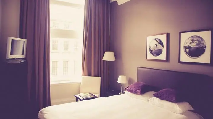
6. Purple Tones
Purple is a definite no for bedrooms because it tends to be too bold and dominant. Brighter purples work better as wall hangings or decorative accents around the bedroom. For purple lovers, the hues are more appropriate for a home office, a busy playroom, or a hobby room with knickknacks.
SAVINA RIZKY HAMIDA
Click here to get the latest news updates from Tempo on Google News