
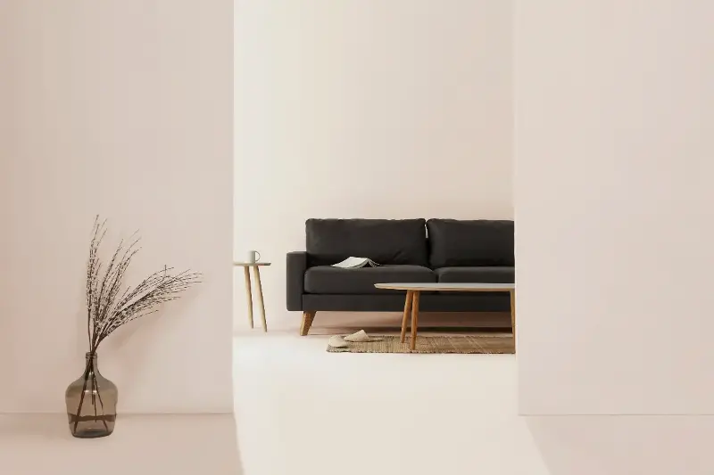
Neutral palettes aren’t just a passing trend—they’re the secret weapon behind homes that exude both calm and quiet luxury. Imagine stepping into a living room bathed in sand, taupe, and soft greige, where every detail is curated for comfort. Neutrals have an uncanny ability to amplify natural light, visually expand spaces, and provide a serene backdrop for both minimalist and maximalist styles. But what truly makes them extraordinary is their endless versatility, laying the foundation for rooms that feel tailored, timeless, and unmistakably refined.
Layers of light: playing with texture and tone
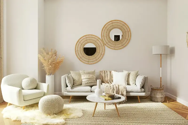
There’s so much more to neutral palettes than just “white walls.” The real artistry comes from mixing subtle variations in shade and embracing texture. Picture a cool ivory sofa set against a charcoal accent wall, topped with nubby wool throws and silky cushions. This interplay of tactile surfaces—think linen drapes, plush rugs, matte ceramics—creates depth and visual intrigue in a room, even when color is understated.
When layering neutrals, consider a progression from light to dark. For example:
- Start with creamy white walls for openness
- Add natural wood furniture in blonde or walnut tones
- Layer in taupes or soft greys through area rugs or throws
- Introduce metallic accents in warm brass or muted nickel
Texture is your friend—combine smooth, rough, shiny, and matte materials to keep the eye moving. Even within a single color, small shifts in texture and finish ignite interest.
Universal appeal: Why neutrals never go out of style
Neutrals work across every style, from urban lofts to country cottages. The trick lies in personalization. In an art-filled apartment, pale walls let statement pieces and gallery grids shine as focal points. In more traditional spaces, classic creamy hues highlight architectural features—paneling, crown moldings, or built-ins.
Surprisingly, neutral palettes are far from boring. Studies in environmental psychology suggest that neutral surroundings lower stress levels, encouraging relaxation at home. For busy households, these tranquil hues adapt seamlessly as lifestyles change, and serve as a graceful canvas for pops of color, greenery, or even seasonal décor.
Curating calm: Easy hacks to achieve the look
Transforming your space into a tranquil oasis doesn’t have to mean a total overhaul. Try these simple strategies:
- Declutter and simplify—fewer objects, more impact.
- Paint one wall a soft putty or mushroom hue for instant warmth.
- Swap bright lighting for soft, diffused sources—think paper lanterns or frosted bulbs.
- Accessorize with natural materials: jute baskets, woven trays, stone vases.
Don’t shy away from subtle contrasts: black-framed artwork or deep brown leather furniture can punctuate the palette, lending richness and definition without disrupting harmony.
Richness without rules: Mixing eras and eclectic finds
Here’s a secret designers love: neutral palettes allow you to blend old and new—mid-century chairs with antique mirrors, modern ceramics with heirloom textiles—without visual discord. This “quiet backdrop, statement accent” formula lets your unique pieces shine. Interestingly, Scandinavian, Mediterranean, and Japanese interiors all leverage subtle palettes to showcase craftsmanship and form, proving that neutrals speak an international design language.
A palette for possibility: The endless canvas
In the end, the real allure of neutral palettes lies in their adaptability and quiet confidence. Neutrals invite you to relax, recharge, and reimagine your home with every fresh detail you add. As you experiment—tweaking textures, tones, and shapes—you’ll discover how stunning simplicity can feel both rich and utterly personal. What story will your serene surroundings tell? The possibilities, much like neutrals themselves, are wonderfully endless.